Perhaps I needed to un-train something.
Field Notes 20260701 - Wednesday
When I started Percept Index I focused strictly on documentation, writing, and analysis of consciousness exploration. After a few months of purely written work I felt the pull to return to illustration, something I spent a lot of time sharpening during my time at CSU Fresno.
Heck, I graduated with a BFA in Graphic Design with an Emphasis in Illustration (and an “Excellence in Multimedia” Award from the Department Chair) — the other side of this story is Magna Cum Laude, which was largely due to all the philosophy courses that I took but failed to declare as a minor and/or double major. I’m not even sure why I list these past accomplishments given the fact that the body of work reveals more than institutional paperwork.
When I began to introduce illustrations paired with, or rather materializing out of, my writing, I stuck with a digital format. I’ve always been comfortable in Adobe Illustrator, and therefore it just became my default that I turn to for image creation over the years. This was all largely done for the Reverie Compendium series. When I made the decision to create illustrations for Field Notes, I had to change my approach.
Field Notes are frequent, about three to five days a week. I’m also limited on time between family life and my career, which were not going to be scaled back in any meaningful way. So, I turned to something that I hadn’t picked back up in about 15 years: traditional illustration.
What’s the big deal? It’s been 15 years, my motor skills have waned, my hand needed to find the rhythm again. Most importantly, I’ve skipped 15 years of consistent reinforcement through practice. I’m not bemoaning it; things have a way of working out just as they should. It’s not a mishap that I’m coming back to traditional illustration all these years later. Perhaps I needed to un-train something, and it’s probably best I don’t go looking for what that was.
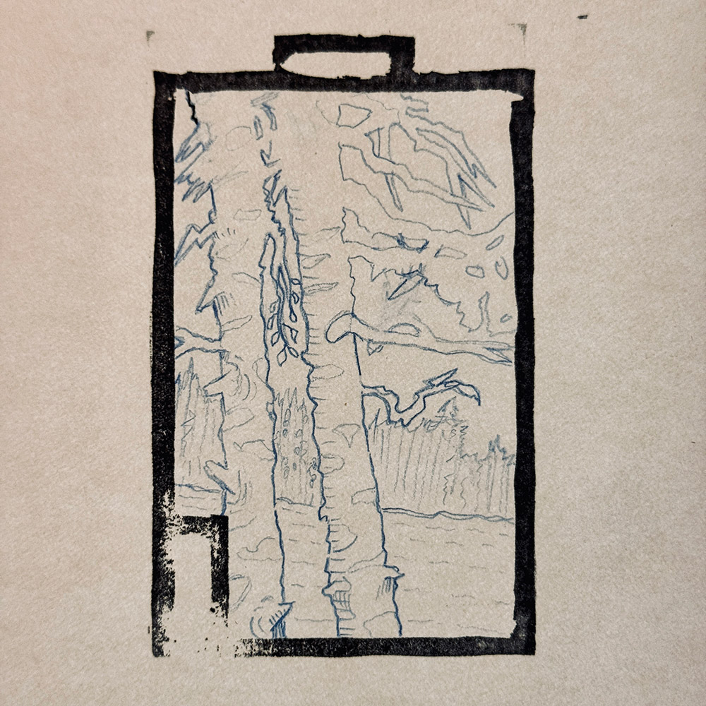
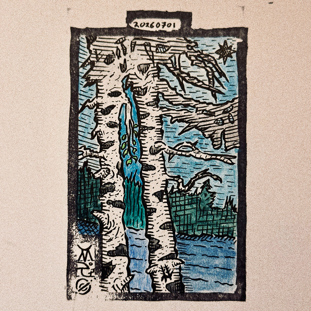
The current format going forward for Field Notes illustrations is a linocut block print for the frame with size referencing cards (playing cards, tarot cards, etc.); gouache, ink, noise texture (derived from a photograph I took), and layering as finish in Photoshop. Copic markers were used heavily for color blocking recently, and they’re not completely out of the picture as I do like blocking large areas with black and using the Copic black brush pen for heavier strokes.
If you compare the very first Field Notes illustrations to where they are now, you’ll notice that I am indeed searching for something. Unfortunately, I have to use one of my least favorite phrases here: “and I’ll know it when I see it.”
Today’s Field Notes illustration:
Kalevala Book Emblem. An emblem from the book cover of an old print I received from my grandmother a long time ago, and the basis for my artist/illustrator mark, as seen on the bark of the tree on the right. Two birch trees stand side by side, and in the space between them a brighter sliver of view opens: falling water, a few green leaves, a lake below, and an eight-pointed star hanging in the branches above. The illustration speaks to thresholds, the kind that only appear when two things stand close enough together. It is about the passage they frame. The way through was there all along; the birches simply make it visible.